The Canadian Socialist Rifle Association is an organization that is both based off of but operates independent from the United States Socialist Rifle Association. The aim of the CSRA is to provide the working class with the education they need to be effectively and legally armed and able to act in service of their community, in a space free of reactionary prejudice.
This includes but is not limited to skills and practice in the safe and legal usage of firearms, emergency medicine, logistics, agriculture, survival, and mutual aid.
The practical realities of existing as a leftist organisation in Canada, however, differ from those of the American SRA.
Canadian laws are stricter and more tenuous; the CSRA must operate more carefully than counterparts south of the border.
Additionally, the doctrine and theory behind of socialist movements have changed over the last 100, 50, even 15 years. We are witnessing a new resurgence of the left among a new generation of young people, who are more diverse and outspoken a demographic than ever.
These factors combined have necessitated our new Canadian Socialist Rifle Association adopt a bold new visual branding system that reflects this contemporary and challenging political landscape.

“A few distinct tensions mark national LGBTQ histories and emerge as key features in LGBTQ design. The first and perhaps most important of these is the ambivalent relationship between seeking broad societal acceptance and finding innate value in homosexuality’s outlaw history…

…indeed, this tension exists graphically, too, in the difference between the unabashed flamboyance of Gilbert Baker’s rainbow pride flag and the focus group-tested logo of the Human Rights Campaign—who, in working closely with design firm Stone Yamashita Partners, made LGBTQ concerns palatable to a broad swathe of the US electorate.”
— Andy Campbell, Queer x Design
IS THERE A WAY TO RECONCILE THE SPLIT IN ACTIVIST DESIGN?
The Sierra branding system is designed to reflect the face of the new wave of progressive, 21st-century socialism sweeping across the world. An aesthetic and style that has newfound unapologeticism in its convictions, radical approach to diversity and inclusivity, and newfound interest in adapting itself to suit any context.

THE LOGO
The Sierra logo was designed with the tenets of being striking, inclusive, and adaptive. The logo takes inspiration from the socialist coat-of-arms aesthetic, including the logos of our SRA siblings south of the border, but with a fresh and bold new appearance that looks to the future more than the past.
WAIT, WHO’S SIERRA?
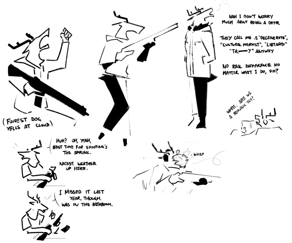
Sierra (they/them) is the nickname for the deer in the logo, a kind of blunt derivation based on the letters “C-S-R-A”.
Sierra is a deer, a traditional “prey” or “hunted” animal who, like us, are depicted as weak and easily frightened by the powers that be, to be chewed and consumed by the jaws of our ravenous capitalist society—no more.

“Hey, asshole,” Sierra called out, grabbing their AR off the bench by the handguard. “I’m the Socialist, and I’m properly Associated with this here f***ing Rifle!”

A NOTE FROM THE DESIGNER
As an otherwise very privileged international student of design coming to Canada to escape political persecution, I felt compelled to donate my time and effort to a leftist organisation such as this one in at least one way I knew how. The Sierra branding represents the fruits of those efforts, and I felt that allowing a grassroots leftist org access to what I think are professional design practises and branding is the least I could do.
That being said, the Sierra branding system is not meant to be a truly universal nor universally-enforced “supreme” singular branding style of the CSRA. Multiple members and volunteers are working on their own branding systems which serve as alternatives to this one; Sierra is merely one such option.
I believe that the designers of the mid-century Modernist period who championed so-called “Universal Design” ended up with something that was anything but; the oversight of considering the specific circumstances and contexts of the people they were supposedly serving in favour of a Western-supremacist outlook arguably led to the failure of the Modernist project, and I believe we should be wary of repeating those mistakes again.
Of course, if the organisation at large wishes to adopt this as its singular “official” branding system, I suppose I would not have any real right to go against the wishes of democratic consensus. But, otherwise, I implore anyone interested in the contents of this document to also explore the alternative methods of representing the organisation. There may be other systems that resonate more with you, and that can only be a good thing. If the failures of Western neoliberal capitalist culture teach us anything it should be that we are stronger when we embrace our diversity, not when we suppress it.
-Kavaeric
If you’d like to view our complete style guide, click here!
